
Learn how to make Isometric Lettering in 6 simple steps in Procreate! Simple and easy to follow.
Date: 24th of September 2020
Est Read Time: 10 min.
Hola everyone!
We know we’ve been quite silent for the last few months (we will blame it on the summer vacations and corona craze) but here we are with the new blog post!
Today we are showing you how to make Isometric Lettering in 6 simple steps in Procreate!
Follow along in the steps below with a few tips and tricks to ease out the process. So, without further ado, let’s get started!
TOOLS TO START THIS TUTORIAL
- iPad Pro
- Procreate Software
- Isometric Grid Brush
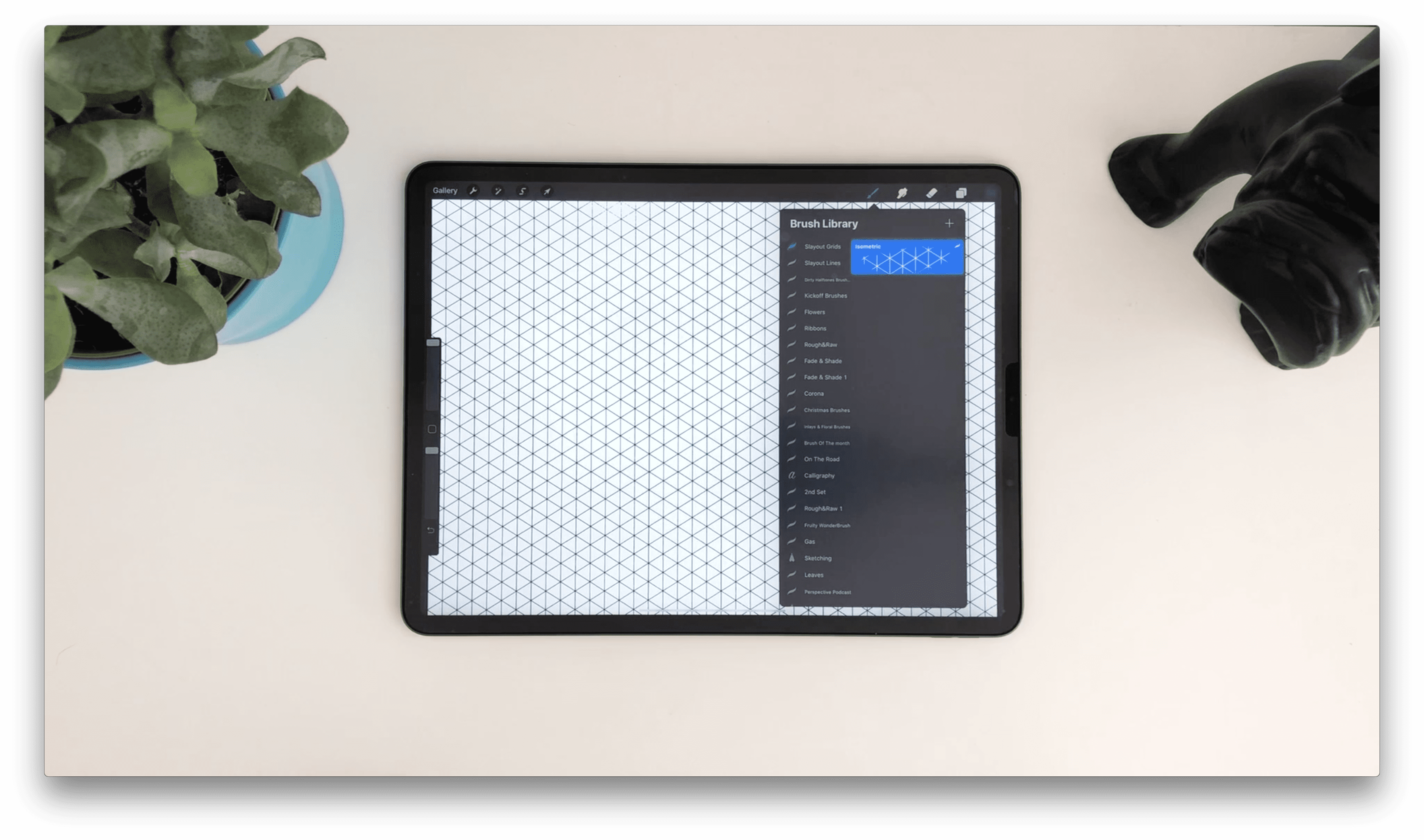
STEP 1: DRAWING THE ISOMETRIC GUIDE
First we are going to draw our Isometric guide. You can use our Brush or you can use an isometric grid that comes with Procreate. If you chose our brush, pick it and draw it across the canvas to create a grid. If you prefer to use Procreate Isometric grid you can do that by going to Actions -> Drawing Guide -> Edit Drawing Guide.
- Draw the isometric guide, by preparing the brushes. Procreate, also has Isometric Guides. For that you can go to Actions, Drawing Guide and Edit Drawing Guide.
- Select and Inker, to start drawing the letters.
STEP 2: DRAWING THE LETTERS - ‘HEY’
Now that we have our grid ready, we will start with letters! Create a new layer and zoom in to draw the first bar of letters. Remember that the best thing you can do is to choose a small word because it’s going to be easier and will fit better to the canvas. For sketching, we picked the Inker Brush from our Dirty Half-Tones Brush Set, but you can choose any pencil or an inking brush you like.
To keep the piece balanced, make sure that every letter has the same width. Since you already have the isometric grid to guide you, this should be really easy! If you are drawing the same word as we are “HEY” - make sure to move the crossbar of the letter “H” a little bit up so it looks optically balanced. This part wasn’t so tough, right? Let’s go to the next step!
- Zoom in to draw the first bar of letters. Remember that the best thing you can do is to choose a small word because it's gonna be easier.
- Pick the Inker Brush from the Dirty Halftones BrushSet.
- To keep the piece balanced, make sure that everything has the same width. Since, you already have the isometric guides, this should be really easy.
- Move the crossbar of the 'H' a little bit up, so it looks optically balanced.

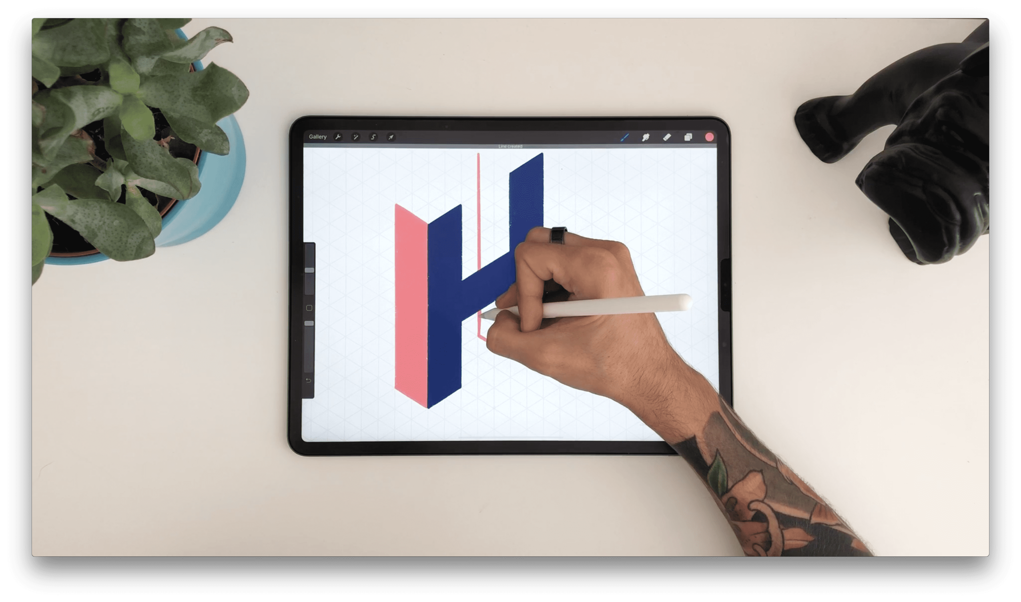
STEP 3: ADDING DIMENSIONS TO THE LETTERS
Now it’s time to give our letters some dimension! First, we will create a new layer and select a new color. It is important to choose another color so you can see more clearly the distinction between the 3D sides of the letter. Start by creating the left side of your letters. When you’ve done that, create a new layer and draw roofs on top of your letter sides. Make sure to put this layer behind other layers (but not the grid one), so you know that you are not painting on top of any other layers.
And here we are, our letters are constructed!
- To give a little dimension to the letter, create a new layer.
- Select a new color and start building.
- Build the roof of the letters, by creating a new layer.
- Then, select a new color and just fill the gaps.
- Make sure to put this layer behind everything else, to know that you’re not painting on top of any of the other layers.
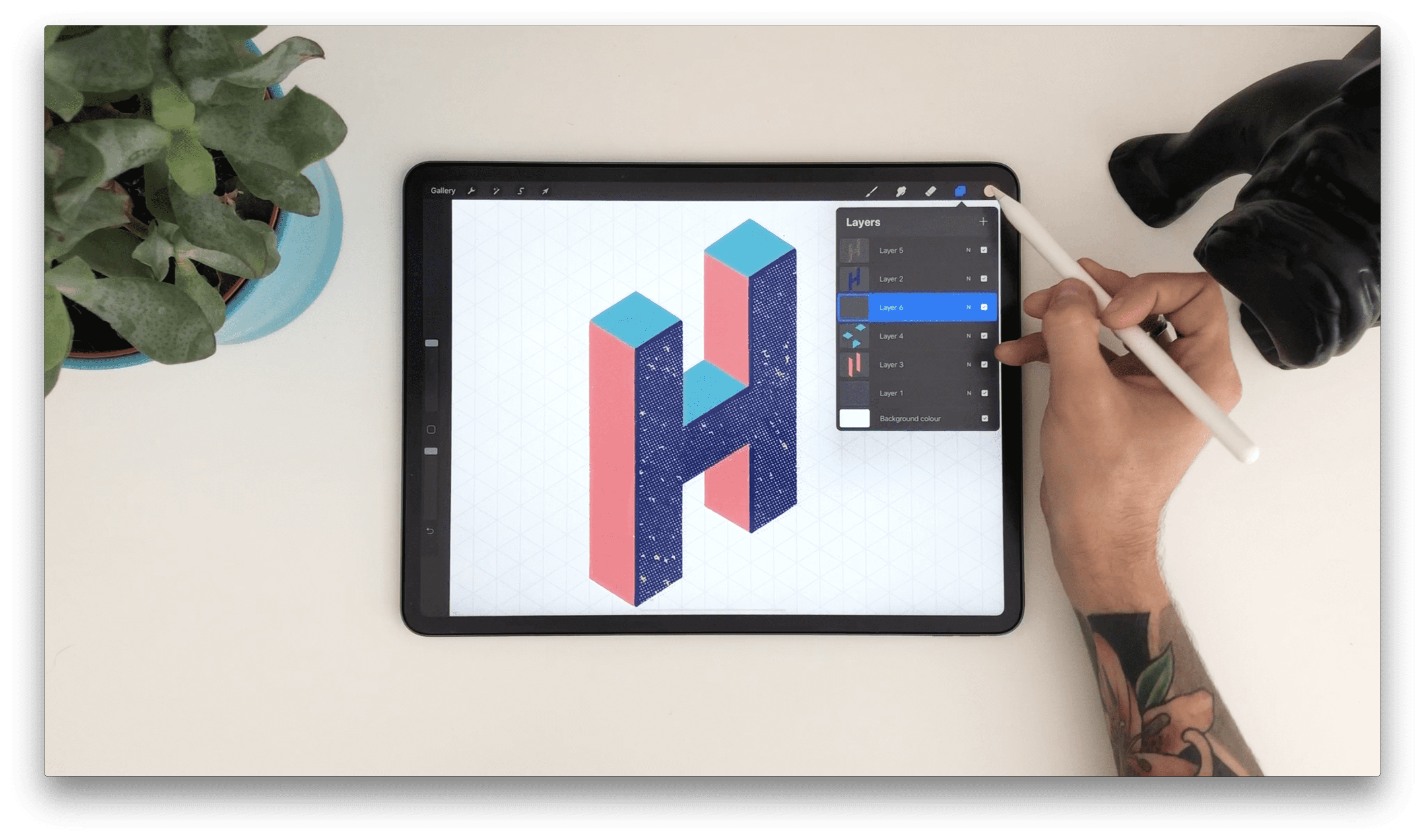
STEP 4: CREATING TEXTURES
And now let’s start with the exciting part - textures! In this tutorial we’ve used some texturizers from our Dirty Half-Tones Brush Set, but as we said before you can use any favorite textures you have.
We will start by creating a new layer on top and picking our texture brush. Now let’s spray away!
When you are happy with your spraying, select the layer with the front side of the letter “H”, tap on the selection tool, pick the automatic selection and then tap on the outside of the letter “H” - in this case the background. Now select the texture layer, swipe with three fingers on the screen and select “cut”. This procedure will make your texture fit perfectly to the shape of the letter. Select the texture layer and move it slightly, turning it left or right or however you please. This will create an offset effect.
And voila! We have our first letter with the texture, easy peasy :D
Click on the left side of the newly created layer and pick “Clipping Mask”. This way, the applied texture will stay inside the shape of the letter “H”.
- In the Dirty Half-Tones Brush Set, you'll find forty-two Half-Tone Brushes.
- Create a new layer on top 'H' and start spraying.
- Select the original 'H' on the layers panel, tap on the selection tool and pick the automatic selection and then tap outside the 'H'.
- Select the half-tones layer, put three fingers down and cut, making the texture layer fit perfectly to the letter 'H'.
- Select it and move it slightly, turning it left or right, or however you please.
- This is going to create an offset.
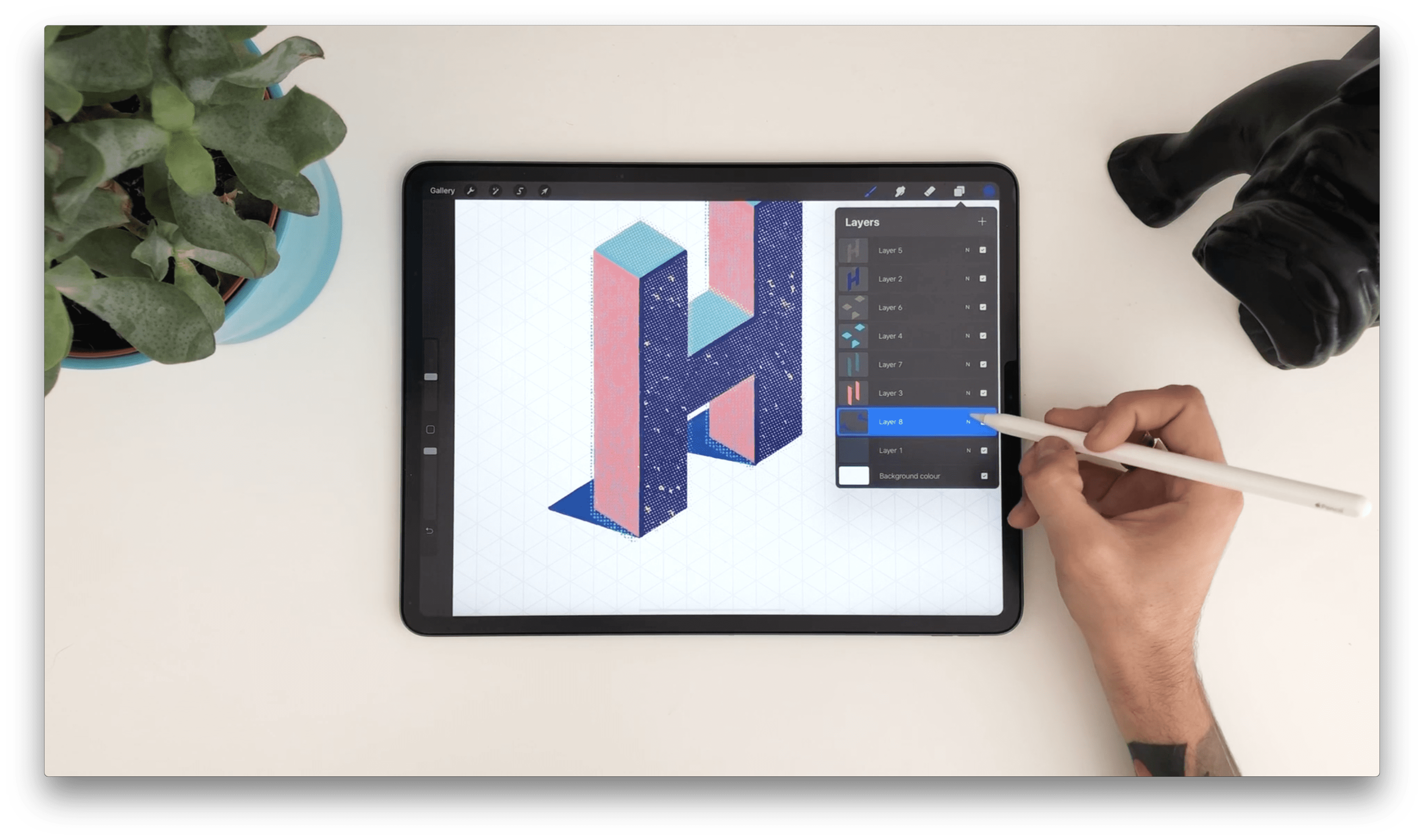
STEP 5: ADDING OFFSET EFFECT AND FINISHING TOUCHES
Now that our first letter is done, we will draw some shadows to add some realism and depth. In this step you can decide where you want the light to come from or you can also choose to go freestyle. Everything is allowed here!
Create a new layer and draw shadows behind your letter. Once you’ve painted them, bring the opacity down on the layers panel. With this we are done with the first letter!
In order to create the next letters, zoom out, snap your fingers and repeat the same steps for the rest of the letters.
- Put cast shadow behind the letter to add some realism and depth. In this step, you can decide where the light is coming from.
- You can also choose to go freestyle.
- Once you've painted them, bring the opacity down on the layers panel. With this we are done with the first letter!
- In order to create the next letters, zoom out, snap your fingers and repeat the same steps.
STEP 6: CREATING A BACKGROUND
Oh yes, we’ve come to our final step! For our finishing touches we will be adding some bedazzle to our background. To do this, create a new layer underneath all the other layers and spray the whole surface with any color and texture you like.

And ta-daaa! You are done creating a super simple and chic Isometric Lettering!
We are sure you created an incredible piece that is just waiting for the world to be seen! Don’t forget to tag us on instagram so we can see what you created.
- For this, create a new layer underneath all the other layers.
- Spray the whole surface with any color you like.

And, you're done creating a super simple and chic Isometric Lettering!
THE END!
We really hope you enjoyed this and that you made some beautiful letters. You can always leave a comment or reach out to us on instagram @jimbobernaus if you want to leave a feedback or tell us if you would like to learn something particular. We would love to help you out!
We wish you a spectacular day with a taste of creativity. And now - letter away!
Join our Newsletter Community, to get access to all of our freebies, including free Procreate Brushes, Textures, Fonts and other fresh stuff!